dialog
Updated pdexter 2025-10-16
A function Object for presenting message dialogs to the user.
(client-side function)
As of Formbird v3.1.x, the ModalService object is no longer initialised with the SweetAlert library object.
See below Post Formbird 3.x.x Implementation for current practice.
Syntax
ft3.dialog(args) // simple mode
ft3.dialog(options)
.then(
function confirmFunction() { .... }
function dismissFunction(dismissType) { ... } );
Older syntax (still works):
ft3.ModalService.openModal(args) // simple mode
ft3.ModalService.openModal(options) // normal mode
.then(
function confirmFunction() { .... }
function dismissFunction(dismissType) { ... } );
dialog has been added to the ruleset include "SweetAlert Dialog", as the preferred object to use for presenting dialogs. It is aliased to ft3.ModalService.openModal, to allow for older coding to still work.
| Part | Description |
|---|---|
| args | Arguments for the dialog function used in simple mode |
| options | An object containing options for the dialog in normal mode |
| confirmFunction | The function to occur on the user clicking OK button. |
| dismissFunction | The function to occur on the user dismissing or cancelling the dialog. |
| dismissType | Whether the dialog was dismissed by clicking cancel, clicking outside the dialog, or escaping |
| Values: 'cancel', 'overlay','close','timer' |
Post Formbird 3.x.x Implementation
Due to conflicts within the Formbird application, the ModalService as provided no longer offers the SweetAlert library functionality, and now only offers a limited dialog service.
This service is basically limited to the following mode of coding:
ft3.ModalService.openModal('Test Message Title', 'This is a test of the button functionality in ruleset script.', 'success');
Ie, a simple three argument function.
If the more complex dialog features as described below are required, then we need to add the following to the top of our ruleset (below #include "JayRule Ruleset Overlay JS"):
#include "SweetAlert Dialog",
providing that your system has the Ruleset Include "SweetAlert Dialog", and that your JayRule is at least version "Haughty Hedgehog" which will run included rules.
For prior versions of JayRule, you can still use this #include, but you will have to manually call in your own initial rule:
ft3.initialiseSweetAlert(ntf, function() {
    // sweetalert is initialised
})
This loads the SweetAlert2 version 6.6.2, which was in place prior to Formbird 3.x.x. Ruleset code that formerly used this dialog functionality will work with this version of SweetAlert.
The SweetAlert library has undergone many changes to its functionality signature, such that changing from some versions to another involves a huge amount of code refactoring.
Should you wish to use another version of SweetAlert, using your own initialisation script, be advised that you will need to be very familiar with the new or different functionality and function arguments.
Options
(From SweetAlert documentation - some discrepancies may occur)
Options marked "Definite" are envisaged to be supported for the full term of the component development in future. Others may also be continued on, and this table is subject to change re those.
| Option | Definite | Default value | Description |
|---|---|---|---|
| title | x | null | The title of the modal, as HTML. It can either be added to the object under the key "title" or passed as the first parameter of the function. |
| titleText | x | null | The title of the modal, as text. Useful to avoid HTML injection. |
| text | x | null | A description for the modal. It can either be added to the object under the key "text" or passed as the second parameter of the function. |
| html | x | null | A HTML description for the modal. If "text" and "html" parameters are provided in the same time, "text" will be used. |
| type | x | null | The type of the modal. SweetAlert2 comes with 5 built-in types which will show a corresponding icon animation: warning, error, success, info and question. It can either be put in the array under the key "type" or passed as the third parameter of the function. As of "SweetAlert Dialog" v202502A (seen in console at initialisation) you can also define "wait" as a type. |
| input | x | null | Input field type, can be text, email, password, number, tel, range, textarea, select, radio, checkbox, file and url. |
| width | x | '500px' | Modal window width, including paddings (box-sizing: border-box). Can be in px or %. |
| padding | x | 20 | Modal window padding. |
| background | x | '#fff' | Modal window background (CSS background property). |
| customClass | null | A custom CSS class for the modal. | |
| timer | x | null | Auto close timer of the modal. Set in ms (milliseconds). |
| animation | true | If set to false, modal CSS animation will be disabled. | |
| allowOutsideClick | x | false | If set to false, the user can't dismiss the modal by clicking outside it. |
| allowEscapeKey | x | false | If set to false, the user can't dismiss the modal by pressing the Escape key. |
| allowEnterKey | x | true | If set to false, the user can't confirm the modal by pressing the Enter or Space keys, unless they manually focus the confirm button. |
| showConfirmButton | x | true | If set to false, a "Confirm"-button will not be shown. It can be useful when you're using custom HTML description. |
| showCancelButton | x | false | If set to true, a "Cancel"-button will be shown, which the user can click on to dismiss the modal. |
| confirmButtonText | x | 'OK' | Use this to change the text on the "Confirm"-button. |
| cancelButtonText | x | 'Cancel' | Use this to change the text on the "Cancel"-button. |
| confirmButtonColor | x | '#3085d6' | Use this to change the background color of the "Confirm"-button (must be a HEX value). |
| cancelButtonColor | x | '#aaa' | Use this to change the background color of the "Cancel"-button (must be a HEX value). |
| confirmButtonClass | null | A custom CSS class for the "Confirm"-button. | |
| cancelButtonClass | null | A custom CSS class for the "Cancel"-button. | |
| closeOnConfirm | x | true | Whether to close the dialog on clicking "Confirm"-button. |
| closeOnCancel | x | true | Whether to close the dialog on clicking "Cancel"-button |
| reverseButtons | x | false | Set to true if you want to invert default buttons positions ("Confirm"-button on the right side). |
| focusCancel | false | Set to true if you want to focus the "Cancel"-button by default. | |
| showCloseButton | false | Set to true to show close button in top right corner of the modal. | |
| showLoaderOnConfirm | false | Set to true to disable buttons and show that something is loading. Useful for AJAX requests. | |
| preConfirm | null | Function to execute before confirm, should return Promise, see usage example. | |
| imageUrl | x | null | Add a customized icon for the modal. Should contain a string with the path or URL to the image. |
| imageWidth | x | null | If imageUrl is set, you can specify imageWidth to describes image width in px. |
| imageHeight | x | null | Custom image height in px. |
| imageClass | x | null | A custom CSS class for the customized icon. |
| inputPlaceholder | x | '' | Input field placeholder. |
| inputValue | x | '' | Input field initial value. |
| inputOptions | {} or Promise | If input parameter is set to "select" or "radio", you can provide options. Object keys will represent options values, object values will represent options text values. | |
| inputAutoTrim | x | true | Automatically remove whitespaces from both ends of a result string. Set this parameter to false to disable auto-trimming. |
| inputAttributes | {} | HTML input attributes (e.g. min, max, autocomplete, accept), that are added to the input field. Object keys will represent attributes names, object values will represent attributes values. | |
| inputValidator | null | Validator for input field, should return Promise, see usage example. | |
| inputClass | null | A custom CSS class for the input field. | |
| progressSteps | [] | Progress steps, useful for modal queues, see usage example. | |
| currentProgressStep | null | Current active progress step. The default is swal.getQueueStep() | |
| progressStepsDistance | '40px' | Distance between progress steps. | |
| onOpen | null | Function to run when modal opens, provides modal DOM element as the first argument. | |
| onClose | null | Function to run when modal closes, provides modal DOM element as the first argument. |
Additional Options
Additional options have been added to the dialog function in order to improve code flow and sequential dialogs.
Attention : These are not part of the SweetAlert library.
attended : true | false
This tells the dialog process to pause code execution and wait for user input before proceeding to the next bit of code.
In general, this is automatically set depending on the configuration of other options for the dialog, but can be explicitly set in the options.
| showCancelButton | input | Default value of attended |
|---|---|---|
| true | * | true |
| * | (set) | true |
| false (default) | (not-set) | false |
In a nutshell, the configuration of a cancel button, or an other input, defaults the dialog to run in attended mode, otherwise it will default to false. If a dialog is intended to just display information, and user input does not influence the path of the ruleset, it is assumed to not be attended.
Await-ing a dialog
(from v202502A)
In terms of simple informational dialogs (with only an OK button), dialogs are "stacked" for display, while the ruleset script continues to run. These may in fact display well after the ruleset has completed. This is to prevent ruleset timeouts occurring when a user has simply neglected to click OK on an informational dialog that doesn't affect the flow of the ruleset.
As of v202502A of the ruleset include "SweetAlert Dialog", and within an async declared ruleAction, we can await the dialog to be acknowledged, before continuing with the ruleset script.
await ft3.dialog('Info','This process has not completed correctly', 'warning');
progressive : true | false
This tells the dialog to allow code to replace the message in the dialog in runtime via successive uses of the dialog function, rather than to stack the messages for sequential display.
The dialog function has been refactored to "stack" messages in sequence, for each to be presented in turn for the user to acknowledge via the OK button, rather than the last message issued overpainting all the previous messages. This option allows the old behaviour to take precedence.
This can be used in the context of a running progress display of a total of processed items, or steps of a process.
In general, this is automatically set depending on the configuration of other options for the dialog, ie:
| showConfirmButton | Default value of progressive |
|---|---|
| true (default) | false |
| false | true |
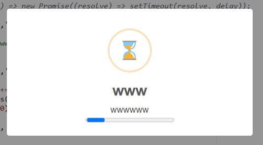
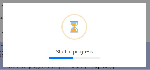
Wait & Progress Dialogs
As of the "SweetAlert Dialog" ruleset include v202502A, we can now present a waiting dialog, which presents with an hourglass icon and an animated progress bar.
ft3.dialog('www','wwwwww', 'wait');
We can also present a progressing wait dialog, with animated progress bar
for (var v=0; v<100; v+=3) {
    ft3.dialog.progress('', 'Stuff in progress', v, 100);
    // do some slow things;
}
ft3.dialog.progress('', 'Stuff in progress completed ok', 100, 100);
Examples
Example 1 - Simple Mode
ft3.dialog('Test Message Title', 'This is a test of the button functionality in ruleset script.', 'success');
Example2 - Normal Mode (with full options)
    ft3.dialog({
      title: 'Are you sure?',
      text: "You won't be able to revert this!",
      type: 'warning',
      showCancelButton: true,
      confirmButtonColor: '#3085d6',
      cancelButtonColor: '#d33',
      confirmButtonText: 'Yes, delete it!',
      cancelButtonText: 'No, cancel!'
    })
    .then(
        function confirmFunction () {
          ft3.dialog(
            'Deleted!',
            'Your imaginary file has been deleted.',
            'success'
          );
        },
        function dismissFunction(dismiss) {
          // dismiss can be 'cancel', 'overlay',
          // 'close', and 'timer'
          if (dismiss === 'cancel') {
            ft3.dialog(
              'Cancelled',
              'Your imaginary file is safe :)',
              'error'
            );
          }
        }
    );
Example 3 - attended mode forced
ft3.dialog({
    title: 'Warning',
    text : 'Asset used more than 24hrs since previous DAYD',
    type: 'warning',
    showCancelButton:false,
    confirmButtonColor: '#3085d6',
    confirmButtonText: 'OK',
    attended : true              // pause processing of ruleset until user clicks ok
})
.then(
    function confirmF() {
        console.log('OK clicked');
        callback();
    },
    function cancelF(dismiss) {
        console.log('dismissed');
        callback();
    }
);
Example 4 - Progressive Mode
ft3.dialog({
    title : 'Propose Valve Markings',
    text : 'Processing ... please wait',
    type : null,
    attended : false,
    progressive : true,
    showConfirmButton : false
});
Confirm and Prompt Functions
The javascript native functions confirm and prompt have been shown to cause issues with process blocking within Formbird, and should therefore be avoided (Oct 2025).
With the ruleset include "SweetAlert Dialog" v202510A, there are replacement functions to take their place, respectively fbConfirm and fbPrompt.
Syntax
var result = await ft3.confirm(message);
var result = await ft3.prompt(message, placeholder, default-value);
// Replace ...
var result = window.confirm('Do you want to run X?');

// ..with
var result = await ft3.fbConfirm('Do you want to run X?');

// Replace ...
var result = window.prompt('Enter new widget name', '', 'Default Widget');

// ..with
var result = await ft3.fbPrompt('Enter new widget name', '', 'Default Widget');